

Hello all! I have some exciting news to share. I have been saying that I will be changing the cover for “Reasons Found In Promises” for a little bit now, and today I will be revealing the new one, as well as talking about the reasons for the decision.
So, if you would like to have the original cover, you will need to order in the next couple of days. As I will be completely switching over both the EBook and Paperback covers by WEDNESDAY DEC 24th
Lets get into it.
Credits to the new cover go FlynX whose portfolio can be found here:
https://flinx23.carrd.co/
Why the Change?
It all came down to one thing: Genre mismatch.
The more I looked at statistic of clicks to sales, or downloads for ARC reads on booksirens, the more I realized there was a pattern of high interest that didn’t convert. After analysis and a probing post on r/BookCovers I realized that as much as I adore the original cover… it falls too far into High Fantasy, and even YA.
The feedback in general was that it barely indicated romance, but even with that it made the book seem more like an ethereal, woodsy, high fantasy. Rather than the more grounded, real world integrated narrative that it actually is.
That left me at a cross roads though.
I am not a huge fan of a lot of covers in the urban fantasy, paranormal, or even dark fantasy genres. Most of them tend to either be big blocky title with some elements that seem rather nonsensical surrounding them, or very photo realistic arrangements of women and animals. Or sometimes men abs. Sometimes AI men abs that look like they are deformed.
Aside from the fact that showing off Ronan’s abs would just be a picture of elk underbelly fur, none of those matched the kind of covers I like or feel fit the books tone.
So I knew I wanted another illustrated cover, that I did not have the skills to make digitally despite being an artist myself.
The Reveal:
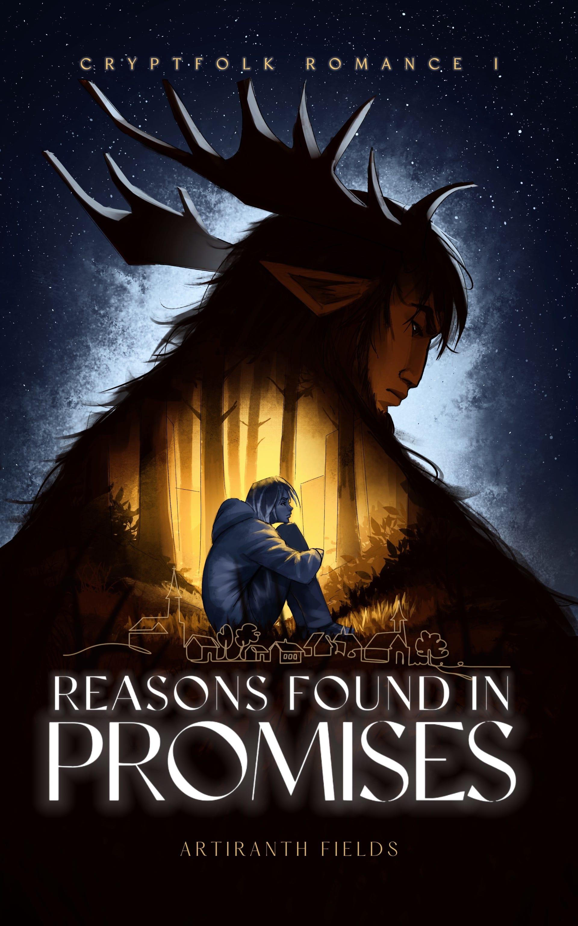
And now I proudly present to you the new cover for “Reasons Found In Promises” with a speed paint of it no less!
Ta da! I think its stunning <3 Big thanks to the artist who did a fantastic job at both creating a gorgeous cover and capturing the essence of the characters so well.
The Choices:
Honestly I pretty much explained the main elements and let FlynX cook and I’m extremely happy I did.
The idea of having a forest inside of Ronan, bathed in warm light in which we have Zoey came from the artist. As he put it, Ronan wants to protect her at all costs. He would put her inside of himself if he could. That’s where Zoey’s home is, in Ronan’s heart. And in his forest.
Zoey’s colder color pallet and posture is indicative of her state through a big part of the story, but the warmth from Ronan is just barely starting to illuminate her as well. There was some questioning as to exactly how “curled up” to make her, and we ultimately decided on this far off gaze. I think it both makes it so that Ronan and Zoey are looking at roughly the same point, which is not only compositionally clever, but is a fun way to show that despite being different they are moving towards a single goal. It is THEIR story, and the POV of the book supports that.
I also had a worry of presenting her as too passive, which she is definitely not. The whole point of the narrative is that despite how much she finds her choices irrelevant, all of them matter, she matters. And so having her too balled up felt like a disservice to the character.
Ronan turning around is actually a moment from the book itself, that I don’t want to spoil. But it is a rather a potent turning point, (ha) of the story. So having it depicted here felt perfect. I also think the pose and expression the artist gave him also captures his mostly reserved demeanor with that complicated emotional landscape hiding just beneath the surface.
The starry sky is a motif kept from the first cover, as there is quite a bit of that imagery in the book. It is often what Ronan refers to Zoey as, and their most intimate moment all happen under the cover of darkness.
We had quite the conundrum on our hands when it comes to the “urban” identification. After some thinking, we ended up adding the small town line above the title in order to indicate that, without overpowering the illustration which focuses on the relation ship between Zoey and Ronan.
And so here we are!
Upcoming Posts
I will be skipping the Thursday post because CHRISTMAS but I will be back on Monday with my take on Romantasy and its current state as…. not really a genre. Again, keep in mind that past the 24th the old cover will no longer be available. I might bring it back for special events or hardback, but the main cover of the book will be the new one by FlynX.
Thank you all for being here, and happy holidays!

The cover looks really striking and atmospheric, with a strong sense of mood that instantly pulls attention and feels very cinematic. What inspired the visual theme you chose, and does it connect to a specific moment or symbol in your story?
A fantastic cover (despite the lack of abs). Kudos to the artist!